Introduction
Singapore society push towards digital payment method became rampant. PayLah! is a wallet mobile wallet which allow us to perform fund transfer via mobile number or QR Codes.
The Problem
Aside from the new app look update. The app is cluttered with a surplus of underutilized features that potentially impedes frequent use. We felt that the user experience had so much room for improvement.

The Team
-
Six months journey.
-
Six individuals with different industry backgrounds.
The Challenge
-
To find the pain points of DBS. PayLah! app.
-
Mostly conducted our meeting thru Zoom, WhatsApp, Slack, Miro, and google drive for project meetings.

●◦◦◦RESEARCH
User Research
We did a user research study for about 2–3 weeks and interviewed 42 participants of different demographics including working adults and students. The majority were in their 30s and some of the interviewees were not fans of DBS PayLah! but we still gathered insight to find out “why aren’t they not using the app.”
-
Research Methods: Desk Research, User interviews, Contextual inquiry
-
Quantitative research: Questionnaires (google form)
Here is the summary of findings :
-
2 in 3 respondents are in the 20–29 y.o. and 30–39 y.o. groups.
-
The majority have at least two E-wallets on their mobile phone
-
DBS PayLah! and Grabpay is the most frequently used E-wallets
-
Shopping , transfer of funds and payments is the most used service
User Goals
How might we enchance security of fund transfers so that PayLah! users will have a peace of mind for every transaction made.
User Challenges
Here are some feedback/reviews given by DBS PayLah! users and NON-DBS PayLah! users:-
“Have a option to send / received funds vis PayLah! or PayNow.”
“Included other banks’ users top-up by credit card.”
“An sms alert on transaction made.”
“Easily cancel or re-call wrong transaction.”
“Reward system for existing users.”
◦●◦◦EMPATHIZE
Afinity Mapping
Affinity mapping is used to identify the common pain points from the usability testing. After all the data collected from the research, we conducted a brainstorming session to find out “what are the users' pain points?” By organizing and categorizing the data, I could understand users and their needs better.

Personas and Customer Journey Map
Based on the key findings and research on the app, we created personas and customer journey maps depicting the user’s behavior, sentiment, and pain-points throughout their stages of using the app.
We created two personas that represented a DBS PayLah! users to guide the case study.
Benjamin Lee
worry about key-in wrong figure during a transaction made.
Lexa Wang
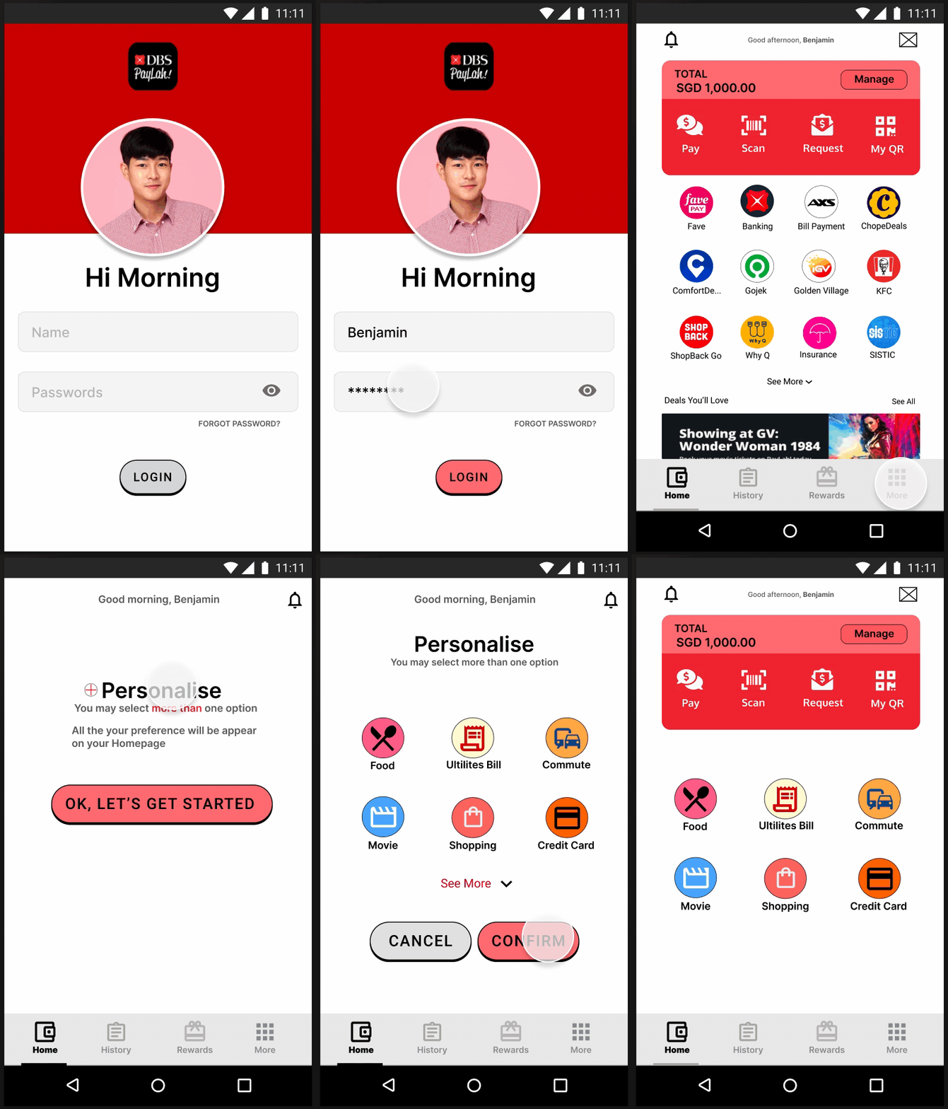
too much of apps icon on the homepage. She prefers to have freedom of amending or put the app on the homepage which often used by her.


Information Architecture
Highlighted in Red is the new Information architecture proposed by the team.

◦◦●◦DEFINE
Wireframe

Behind the screen - LoFi Wireframe
After we gained a clearer picture of the users’ needs and priorities.
These were the problem to solve for the re-design:-
-
Confuse on icons Hompage, some is repeated interaction (Utilities, Telcos and Insurance)
-
additional verification
-
Cancellation on mistake transaction
-
We started sketching and preparing low-fi wireframes. We could get some ideas through this sketch storming.
We decided to come up with Two use cases for our proposed solution.


◦◦◦●IDEATE
Mock-ups
After finished designing an interactive prototype, I showed my mock-up to some intervieews and tweaked it a little more after a round of feedback. I conducted a usability test and checked if my proposed solution resolved their pain points.
Prototype
Here are Two Use case of Prototype, I showed to intervieews.


Recall within 30 Seconds


Personalise
TAKEAWAY
Working on this capstone project has been a great experience. Looking back at all my notes and sketch. I was really glad that I could deliver a prototype (Wow!😂). Throughout the 6 months journey, The re-design force me to get out of my comfort zone to learn from zero.
A big thanks to 👏 👏👏my teammates, and those who took part in my interviews👏, and to you 😘 who read till the end! 😁
If you have any feedback, I’d love to hear from you. Feel free to connect me on LinkedIn
- The End -
-------------------------------------------------


